When U.S. inflation started creeping up in early 2021, economists were confident that it would prove transitory. As prices have risen higher, that view has taken a beating. Yet, the most comprehensive attempt to distinguish transitory from persistent inflation still suggests that the latest uptick will not last.
The data comes from the New York Federal Reserve’s underlying inflation gauge (UIG). When work on the UIG began in the early 2000s, there were already several measures of inflation that attempted to remove excess volatility. The best known of these is the core CPI (that is, the full CPI with food and energy prices removed). But although that approach helps, it has known problems. One is that the specific items that cause excess volatility in the CPI may change over time. Another is that the best predictors of inflation trends may not be found among the data used in constructing the CPI.
To get around those problems, the UIG adds dozens of additional indicators to the set used in measuring inflation, rather than leaving some out, as the core CPI does. The added indicators come in two flavors. One is additional price data that is not covered by the CPI, such as prices paid by producers and import prices. The other is additional factors like labor market conditions, monetary variables, and financial indicators such as interest rates and stock prices. A statistical technique called dynamic factor analysis selects the most useful indicators for understanding persistent inflation.
Using this method, the New York Federal Reserve produces two versions of the UIG, one based on prices-only data and the other on the full data set. These are characterized as measures of the persistent common component of monthly inflation.
The following chart shows data for the CPI and the two UIG measures from 2010 through April 2022.
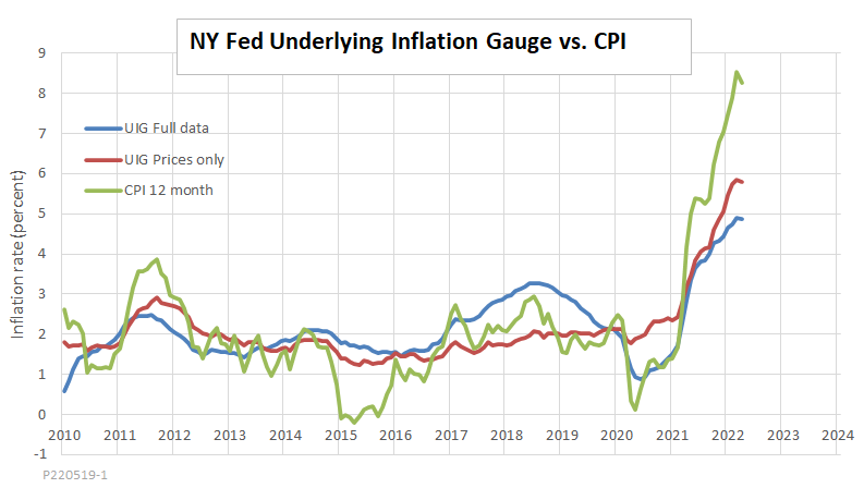
Both UIG series succeed in removing substantial volatility from the CPI. For example, both UIG series rose less than the CPI during the short-lived inflation episode in 2011, and both fell by less than the CPI during the equally short-lived dip in 2015.
During the recent inflation run-up, both the prices-only UIG and the full-data UIG have risen, indicating that much of the inflation we are witnessing is real. That is not surprising since recent price increases have been traceable in large part to easily confirmed disruptions in supply chains. However, prices-only UIG inflation is up only 70 percent as much as CPI inflation, and the full-data UIG is up by just 58 percent.
The bottom line is that we should not read too much into the slight downturn in all three measures of inflation between March and April. Still, both UIG measures suggest that it is wrong to dismiss the hypothesis that much of the inflation we are now witnessing will indeed turn out to be transitory.
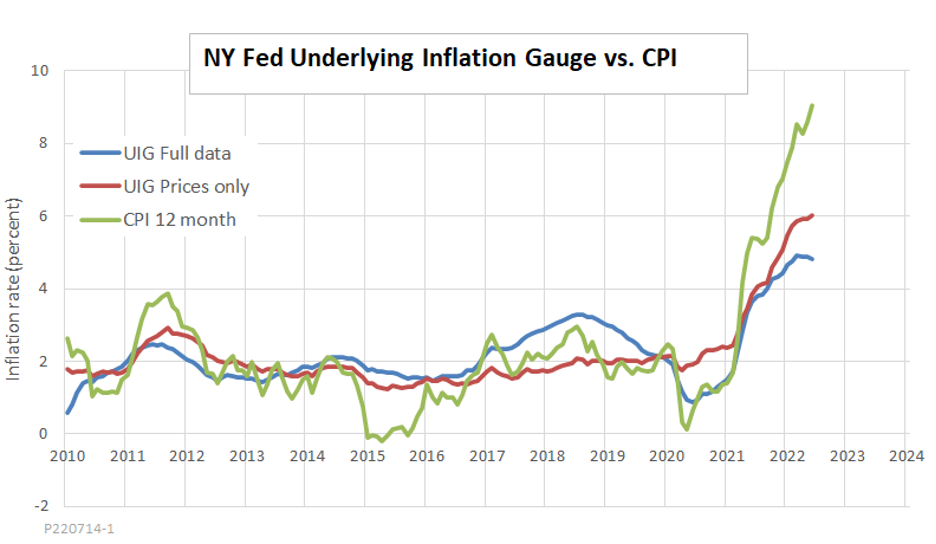
Update (July 14): Over the past two months, CPI inflation has continued to rise. However, the full-data UIG (blue line in this chart) continues to fall from its March peak and now stands at just half the CPI inflation rate.
CPI inflation is what pinches budgets when it comes time to pay the bills. I would by no means dismiss its impact on politics and the economy. Still, the UIG is better as an analytic tool when thinking about how long the current wave of inflation will last.
Photo Credit: iStock