Anyone who has been following the U.S. monthly economic data lately has noticed that the rate of inflation has been rising over the past year as the unemployment rate has fallen. Here are the numbers:
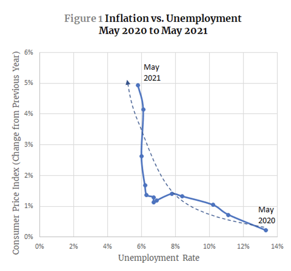
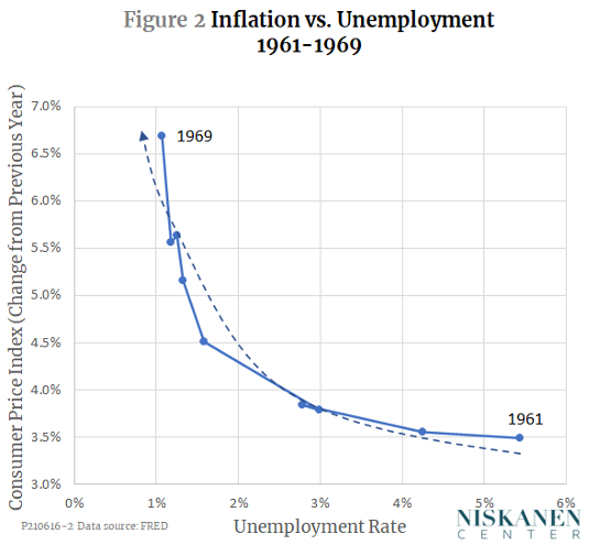
To those old enough to remember, this chart looks ominously like the first inflationary surge of the Kennedy-Johnson years:
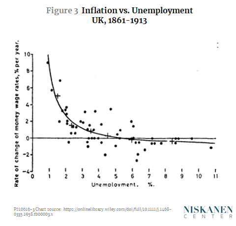
Or even more ominously, Figure 1 looks a bit like this chart from a 1958 article by A. W. Phillips, which later became famous as the “Phillips curve.”
So, are we in for runaway inflation unless we slam on the brakes and send unemployment soaring again? You might think so from the headlines inspired by recent CPI reports, but the answer is “no,” or at least, “no time soon.”
To see why, we need to understand just what the dreaded Phillips curve is, why falling unemployment brought soaring inflation in the 1960s and 1970s, and why it is far less likely to do so now. That will require a detour into a bit of economic theory, then a review of the history of inflation and unemployment over the past six decades, and then an analysis of the psychological underpinnings of economic behavior. Here we go.
The dynamics of the Phillips curve
When the Phillips curve first came to widespread attention in the late 1950s and early 1960s, it was interpreted by many as a static policy menu. You could get unemployment down to a very low level if you were willing to tolerate a bit of inflation, or you could stop inflation in its tracks if you were willing to tolerate a bit more unemployment. By the late 1960s, however, the idea of a fixed Phillips menu was called into question by Milton Friedman and Edmund Phelps. In their view, the inverse relationship between inflation and unemployment was only a short-run phenomenon. In the long run, the Phillips curve could shift up or down under the influence of changing inflation expectations. The next two figures contrast the simple, static Phillips curve with its dynamic version.
Figure 4 shows the simple, static version of the Phillips curve. The vertical black line in the figure represents the so-called natural rate of unemployment,that is, the rate that prevails when the economy is neither in an unsustainable boom nor in a slump, and when there is neither upward nor downward pressure on the rate of inflation.
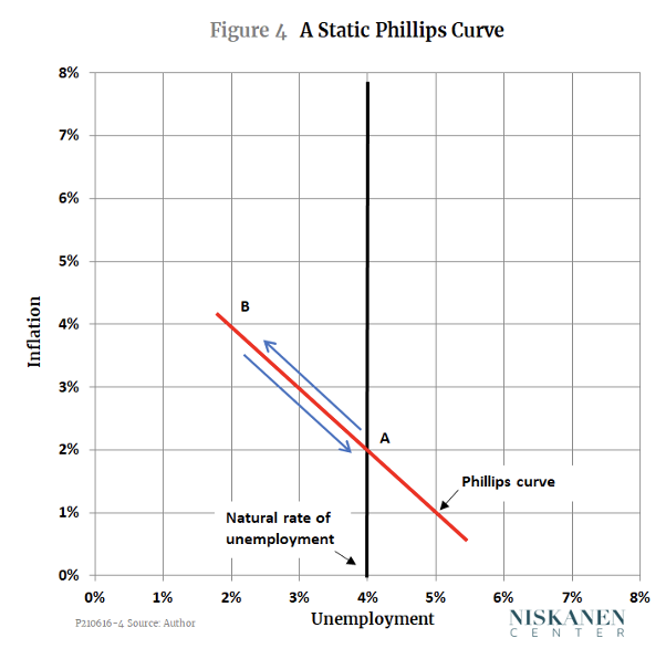
Suppose that initially, the economy is at Point A and has been there long enough that everyone has come to expect that situation as normal. Next, suppose there is a temporary surge in the aggregate demand for all goods and services, caused by expansionary monetary or fiscal policy. Employers will respond to the surge in demand either by increasing their output or increasing their prices, or (most likely) some combination of the two. To increase their output, firms will need more workers. As more jobs open up, unemployed workers, whether new entrants or those who are between jobs, will be able to find work more quickly than usual. Shorter average spells of unemployment reduce the unemployment rate, which is the ratio of unemployed workers to the size of the labor force, both employed and unemployed. As firms increase their output and prices, and as previously unemployed workers find jobs more quickly, the economy will move up and to the left along the Phillips curve toward Point B.
So far, we have assumed that the increase in demand is only temporary. If so, as soon as the surge in demand has run its course, the whole process will reverse and the economy will move back down along the Phillips curve to Point A. But the key insight of Friedman and Phelps was that the dynamics of prices and employment change when movements in aggregate demand are no longer temporary and unexpected. Figure 5 shows how that works.
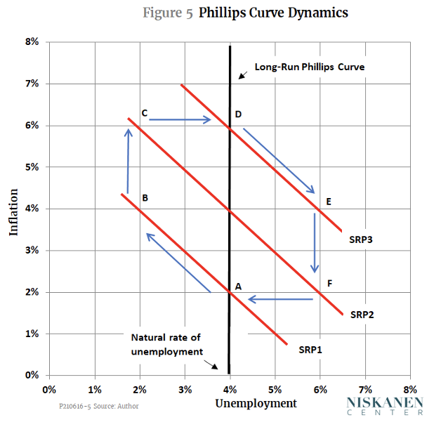
This time, suppose that after the economy moves from A to B, aggregate demand continues to increase rather than falling back to its original level. As time goes by, both firms and workers find that the conditions that brought them to point B, where inflation is 4 percent and unemployment is 2 percent, are not sustainable. Workers will see that the previous year’s inflation has eroded their cost of living. Employers will find that prices of nonlabor inputs (which, after all, are just the outputs of other firms) have gone up, eroding their profits. Encouraged by the ongoing growth of demand, however, firms find they can maintain a high rate of output and raise their prices by enough to make up both for the higher wages that workers ask for and the higher costs of inputs. As a result, the economy moves from B to C.
In effect, once firms and workers come to expect the 4 percent inflation experienced at Point B, the whole short-run Phillips curve shifts up from SRP1 to SRP2. But once the economy reaches Point C, inflation expectations rise still more, pushing the short-run Phillips curve further upward to a position like SRP3. As long as policymakers keep boosting the rate of growth of aggregate demand with expansionary monetary and fiscal policy, unemployment can be kept low, but only at the expense of ever-faster inflation.
Suppose, though, that at the moment the economy reaches Point C, the Fed, deciding that inflation is too high to tolerate, raises interest rates enough to stop the upward drift of the Phillips curve. That will take away the incentive for firms to maintain output and employment at such a high level. The economy will begin to move down and to the right along the short-run Phillips curve SRP3. If demand remains constrained, the economy will move past the natural-rate-of-unemployment, represented by point D, to a point like E.
Once unemployment is above the natural rate, the dynamics of the system will reverse. With demand weaker, firms will slow the rate at which they raise prices and wages. Workers, seeing that jobs are hard to find, will not demand such generous wage increases. The short-run Phillips curve will begin to move down again, and the economy will move toward a point like F, with high unemployment but a falling rate of inflation. From there, if policymakers get the timing right, they can give just the nudge to aggregate demand that is needed to move the economy back to a soft landing at Point A, where we started.
In short, in the dynamic version of the model, the long-run Phillips curve is a vertical line at the natural level of unemployment. In the long run, unemployment cannot be held far above or far below its natural level at any constant rate of inflation. But as the rate of aggregate demand rises and falls over time, the economy does not move smoothly up and down along the long-run Phillips curve. Instead, it makes a series of clockwise loops, with periods of low unemployment and accelerating inflation balanced by periods of higher unemployment and slowing inflation.
The stop-go era
Simple though it is, the shifting Phillips curve model corresponds remarkably well to the actual behavior of the U.S. economy from the 1960s through the early 1990s. As shown in Figure 6, over that period, the economy traced a series of clockwise loops that look much like the stylized version shown in Figure 5.
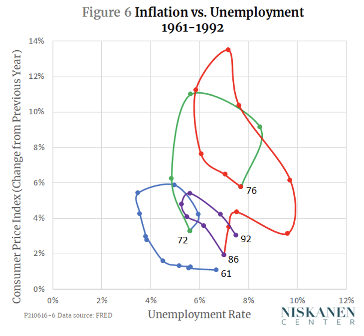
This behavior of the economy has been described as a “stop-go” cycle because it reflects alternating episodes of expansionary and contractionary monetary and fiscal policy. The first two loops show that in the 1960s and 1970s, there was an upward bias to the cycle. Policymakers were slow to apply the brakes as the cycles approached their peaks, and quick to accelerate again well before inflation had fallen back to the rate it started from. Because the average rate of inflation and average rate of unemployment both increased from cycle to cycle, this pattern was sometimes called “stagflation” – a term I have never liked, since “stagnation” seems to imply that the economy was standing still, when instead it was looping crazily out of control.
Not until the appointment of Paul Volcker as Federal Reserve Chair by President Carter in 1979, and the subsequent election of Ronald Reagan, were the deceleration phases of the cycles carried through strongly enough to bring inflation below the rates of 1972 and 1976, years when the process of disinflation was abandoned before it was complete.
From stop-go to the Great Moderation and the Great Recession
Just as it seemed that the stop-go cycle and the shifting Phillips curve model might become permanent features of the U.S. economy, the picture changed dramatically. As Figure 7 shows, from the early 1990s to late 2007, the U.S. economy entered a phase that became known as the Great Moderation. During that period, inflation moved within a remarkably narrow range, never more than 3.4 percent or less than 1.5 percent. The unemployment rate was similarly constrained, ranging from slightly under 4 to barely over 6 percent. The economy had never before (or since) come so close to the goal of simultaneous full employment and price stability.
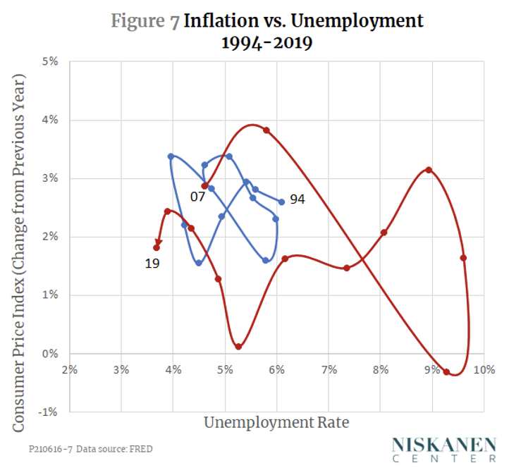
The Great Recession, which officially began in late 2007 and deepened dramatically during the financial crisis of 2008, brought the Great Moderation to an end. Unemployment reached a monthly peak of 10 percent in October 2009. Inflation, however, remained within a narrow range even in 2018 and 2019, when the unemployment rate fell below 4 percent for the first time since the mid-1960s.
The role of expectations
The patterns of inflation and unemployment in Figure 7 differ from those in Figure 6 not only in their limited range, but also in their dynamics. Whereas the stop-go era was characterized by a series of clockwise loops, that pattern disappeared after the early 1990s. To the extent there is any regularity at all to the squiggles in Figure 7, they look like a pair of blue and red bow ties. Note especially that the right-hand sides of each bow tie trace out counterclockwise loops – a pattern that is fundamentally inconsistent with both the observations shown in Figure 6 and with the theory of the shifting Phillips curve that was represented in Figure 5. What happened?
The answer is that there was a change in the way that firms and workers formed their expectations of inflation. The Friedman-Phelps shifting Phillips curve model is based on what economists call adaptive expectations. That means that market participants form their expectations of future inflation on the basis of what they have observed in the recent past. Figure 5 assumes a very simple form of adaptive expectations in which each year’s short-run Phillips curve intersects the long-run Phillips curve at that year’s expected rate of inflation, and each year’s expected rate of inflation is equal to the previous year’s observed rate of inflation.
In contrast, the behavior of the economy since the early 1990s reflects anchored expectations. In this period, the Fed avoided abrupt, unexpected policy changes, and was very explicit about doing so. The resulting “anchor,” then, was the Fed’s clearly communicated intention to hold inflation at or close to a target rate of 2 percent, come what may.
With the expected rate of inflation anchored at 2 percent, the Phillips curve stopped shifting. Subject to small random shocks, and with some lags, the economy moved within a narrow range of inflation and unemployment. In that regard, the outcome was more like what would be expected with a fixed Phillips curve like the one in Figure 4. In fact, it could be said that expectations were anchored strongly enough that the short-run Phillips curve itself became flatter, so that even large variations in unemployment, such as those observed during the Great Recession, did not cause comparably large variations in inflation.
Former Federal Reserve Chair Ben Bernanke summed the point up nicely in a 2007 speech to a workshop at the National Bureau of Economic Research:
The extent to which [inflation expectations] are anchored can change, depending on economic developments and (most important) the current and past conduct of monetary policy. In this context, I use the term “anchored” to mean relatively insensitive to incoming data. So, for example, if the public experiences a spell of inflation higher than their long-run expectation, but their long-run expectation of inflation changes little as a result, then inflation expectations are well anchored. If, on the other hand, the public reacts to a short period of higher-than-expected inflation by marking up their long-run expectation considerably, then expectations are poorly anchored.
What lies ahead and what to watch
Bernanke’s remarks tell us what we need to know to answer the questions we began with: Is the Phillips curve back? And when should we start to worry about inflation?
The answer is that the shifting Phillips curve is not back, nor do we need to worry about inflation, so long as inflation expectations remain anchored. As long as they do, we may well see some increases in the price level as the economy recovers from the pandemic, but those are likely to remain transitory. And expectations will remain anchored, as long as employers, workers, and financial markets remain confident that policymakers are serious about holding the average inflation over an appropriate time horizon to a target level within a percentage point or so of the 2 percent that we have become accustomed to over the last three decades.
“Anchored” does not mean that the Fed has to be ready to stomp on the brakes at the first sign that monthly CPI figures go above 2 percent. The Fed has made it clear that it will allow some catch-up relative to the very low inflation rates of 2020. We can also expect it to disregard transitory blips in the CPI caused by things like the recent jump in used-car prices. In fact, the Fed pays little attention at all to the headline-making CPI, preferring to look at other indicators that better reflect underlying inflation trends.
So, can we go to bed at night, sure that all is well? Not quite. Even if the Fed is determined to do the right thing, it is going to be technically hard for it to provide just the right degree of stimulus or constraint over the coming months. The United States has not experienced an economic shock like the pandemic for many decades. Among other things, that means that the Fed’s models and forecasts may not be accurately calibrated for what is happening right now.
Furthermore, in an ideal world, the Fed would not have to do the whole job of managing inflation and unemployment by itself. Economic textbooks tell us that policymakers are best able to guide the evolution of aggregate demand when they have two levers to pull: monetary policy and fiscal policy. Unfortunately, U.S. fiscal policy is politicized and paralyzed. Congress is as likely to do the wrong thing – too much fiscal stimulus, or too much austerity, or first the one and then the other – as it is to behave prudently. That will make the Fed’s job harder.
But even the kind of bungled fiscal policy that complicated the recovery from the Great Recession is unlikely to lead to anything resembling the kind of stop-go instability that we saw in the 1960s and 1970s. Not, at least, if expectations remain anchored.